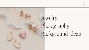
When you’re launching a jewelry brand, it’s easy to get obsessed with buying the most expensive camera or the brightest lights. But here is a secret from the pros: the most expensive camera in the world won’t save a photo if the background is working against you.
In jewelry photography, the background is the “stage.” Because rings and necklaces are small and highly reflective, the surface they sit on doesn’t just sit there—it interacts with the light, reflects onto the metal, and tells the customer whether the piece is worth $20 or $2,000.
What Exactly Is a Jewelry Photography Background?
Simply put, it’s the surface and the vertical space behind your product. But in the “micro-world” of jewelry, every tiny detail counts. A background can be a physical prop, like a piece of Italian marble or a swatch of silk, or it can be a digital “pure white” environment created in post-production. It serves to provide contrast, depth, and a sense of scale.
Why the Background is Your Silent Salesman
Think about the last time you browsed a luxury site. You didn’t just see a ring; you saw a mood.
-
Contrast: A silver pendant disappears on a light gray background but looks electric on dark slate.
-
Consistency: When every photo on your site uses the same marble texture, it tells the customer you are a stable, professional brand.
-
The “Feel” Factor: Different textures evoke different emotions. Wood feels “earthy and artisanal,” while black acrylic feels “modern and high-end.”
The Beginner’s Toolbox: 5 Background Ideas That Work
-
The “Amazon” White: It’s mandatory for many marketplaces. It’s clean, it’s fast, and it makes colors look accurate.
-
Matte Stone & Slate: These are perfect because they don’t reflect light back into the jewelry. They provide a high-end, heavy feel.
-
Reflective Acrylic: Use a black or white acrylic sheet to get that beautiful “mirror reflection” beneath a watch or a ring.
-
Linen and Silk: Soft fabrics add a “lifestyle” touch. The folds in the fabric can create leading lines that point directly to your product.
-
Brushed Metal: Using a different type of metal as a background can create a very industrial, sleek look.
The Challenges: Reflections and “The Muddy Look”
The biggest headache for beginners is the “Mirror Effect.” Since gold and silver are essentially tiny mirrors, they will “eat” the color of your background. If you use a bright yellow background, your silver ring will look tarnished and green.
This is where the reality of e-commerce kicks in. Even with a perfect background, you’ll deal with dust specks that look like boulders and reflections of your camera lens in the metal. To bridge the gap between a “good” photo and a “Tiffany-level” photo, most successful sellers rely on Jewelry Photo Retouching Services. These experts can digitally polish the metal, sharpen the “fire” inside a diamond, and ensure the color of the gold is perfectly true to life, regardless of what the background was doing during the shoot.
Real-Life Case Study: From “Etsy Hobbyist” to “Luxury Brand”
A small designer was selling handmade copper jewelry. Originally, she took photos on her kitchen table. The wood was too “busy,” and the grain distracted from her delicate wire-wrapping.
The Solution: She switched to a simple, matte-black cardstock. She used a single side-light to create a dramatic shadow. The Result: Her “Click-Through Rate” (CTR) doubled. Why? Because the copper glowed against the black, making it look expensive and intentional rather than “homemade.”
How to Choose (The “How-To” for Beginners)
-
For Gold: Stick to warm tones, deep blacks, or dark greens.
-
For Silver/Platinum: Use cool grays, navy blues, or crisp white.
-
For Colorful Gemstones: Use a neutral background (white or gray) so the background doesn’t “fight” with the color of the stone.
FAQ
-
Can I use my iPhone? Absolutely. Just use a tripod.
-
What if I have no budget? Go to a flooring store and ask for “remnant” tiles of marble or slate. They usually give them away for free or for a few dollars.
Conclusion
Your background is the foundation of your visual brand. It’s the difference between someone scrolling past your ad and someone stopping to zoom in. By choosing a background that complements your metal and stones—and then finishing the look with professional amazon photo editing services—you create an image that doesn’t just show a product, but tells a story of quality.


